Hotel Blue
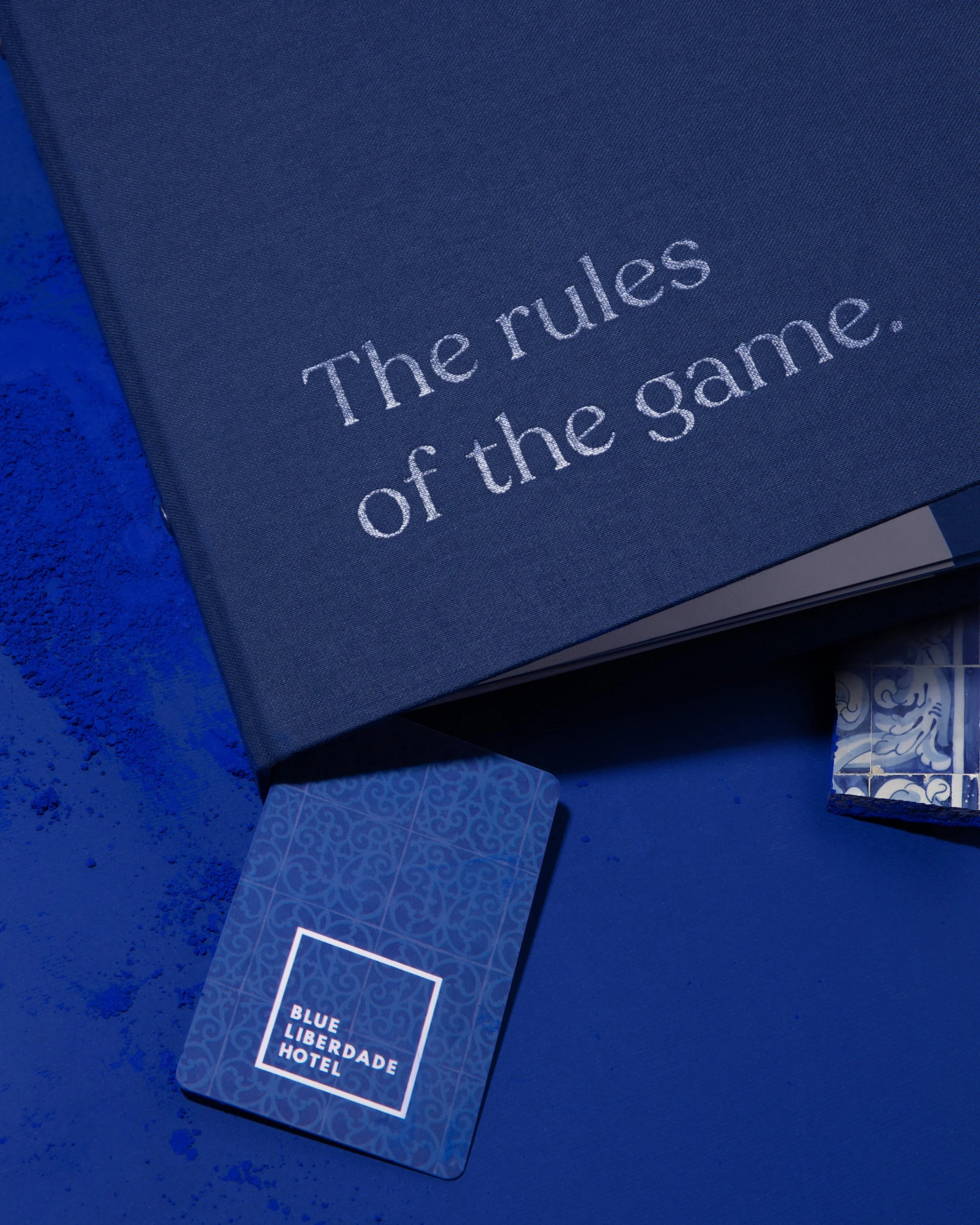
A branding project designed for Hotel Blue Liberdade in Lisbon by Atelier Maldonado.
HOTEL BLUE LIBERDADE
For Blue Liberdade Hotel, we kept it minimal and urban and…blue. The square frames all the blues of Lisbon. The blue of the tile, the sidewalk, the sky, the hotel's façade, the river. This is the motto for all the communication. It's not about the blues; it's about the hues – The challenge was about transforming colour into a colourful experience (pun intended), making every encounter with the branding fun and vibrant.
Cidade azul
semeada
de céu
Adília Lopes
To complete Blue’s branding we designed a range of collateral design: brochures, do not disturb cards, folders, directory, calling cards, notepads, keycards, postcards, coasters, to name a few. All conveying the blue idea not only with graphics but also with a fun, uplifting copywriting, which we hope, makes guests smile.


